
Accessibility at Scale
Accessibility was not on our roadmap. Customer asks kept arriving anyway. I put my hand up to own it.
Over two years I turned scattered requests into a funded, phased program: selected an audit vendor, mapped the product so nothing would be missed, and phased remediation by audience, customer-facing surfaces first, then CSM, then admin, fixing at the component level as we went. It ended with a VPAT, a design system running one version instead of several, and accessibility that was no longer a fire drill.
The asks came in from everywhere
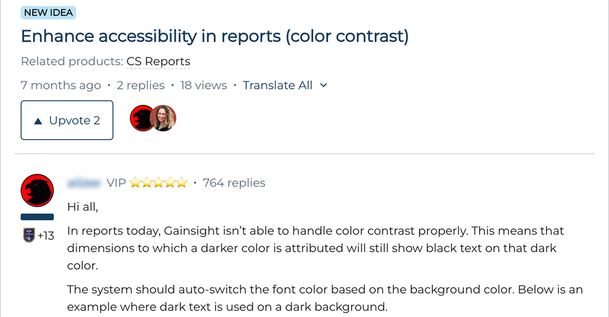
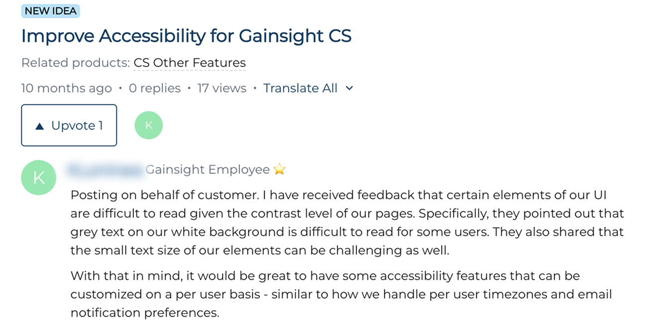
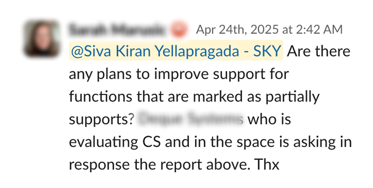
Ideas posted in the customer community. Account teams forwarding contrast complaints. Slack messages from sales during evaluations, asking about the controls our VPAT marked as “partially supports,” because a prospect had asked.
Each one was small enough to handle on its own. That was the problem. Nobody was counting them, so nobody could see that we were walking into enterprise evaluations without a credible answer, and that no one owned the gap.
I decided to.
Making it a funded program
I took the pattern to leadership. This was not a backlog of UI bugs. It was a procurement blocker with a growing tail, and it would only get more expensive to fix the longer the product kept shipping on top of it.
I asked for three things: budget, an external audit partner, and a definition of done we could actually be held to. We settled on WCAG 2.1 AA, with the VPAT as the tangible deliverable.
That turned accessibility from something everyone agreed was important into something that had an owner, a scope, and a date.
-
Secured executive commitment
Made the case to leadership directly, so accessibility became a funded, owned initiative rather than a side effort. Everything downstream depended on that mandate.
-
Shaped the investment case and the bar
Helped build the budget case and defined what “done” meant: conformance against WCAG 2.1 AA, with the VPAT as the deliverable that proved it.
-
Owned it end to end
Drove the program across product, engineering, QA, and customer success, from a cold start through execution, governance, and customer communication.
Choosing the vendor
I spoke to several accessibility vendors before selecting one.
Most could run a checklist and return a list of violations. That was not the hard part. Our product changes behaviour based on role, permissions, and tenant configuration, so the same screen can look correct for one user and be unusable for another. A vendor who could not navigate that would either miss real failures or report failures that were not real.
I chose the partner who could tell the difference, and who could test across assistive technologies, browsers, and operating systems on a product of this size.
Making sure no screen was missed
The risk with a platform this large is that the audit only covers what the vendor happens to find.
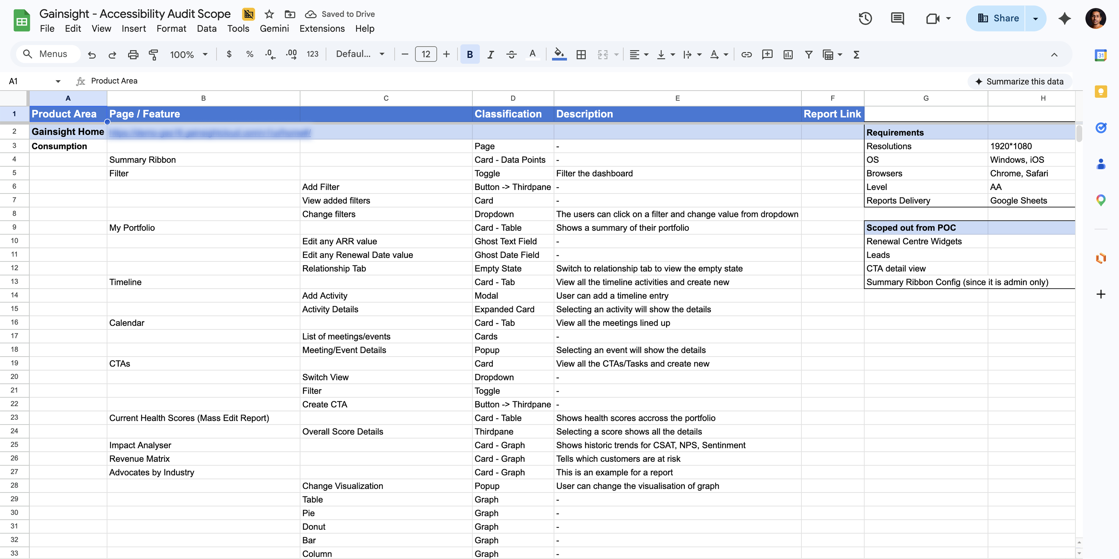
So before testing began, I built the product architecture in Excel: every module, every page and feature, the classification of each element, and the flows and states that mattered. Then I recorded video walkthroughs so the vendor understood not just where a screen was, but what it was for and how customers actually used it.
It was unglamorous work. It was also the reason the audit came back with coverage we could trust, and the reason we never had to argue about scope halfway through.
-
Screen-by-screen flow documentation
Mapped every in-scope surface so findings landed against a concrete screen and state, not an abstract rule.
-
Feature walkthrough recordings
Recorded flows and business context so the vendor understood the why behind each screen, not just the markup.
Three ways to sequence two years of work
Once the audit scope was clear, the sequencing question was the real decision. Three options were on the table, and each closed off something.
What we gave up. We phased by audience: customer-facing surfaces first, then CSM, then admin, fixing the components each phase needed at the component level as we went. Nothing was built at the screen level and redone later; the cost was sequencing, not rework. We prioritized this way to close customer-facing exposure early and have something credible to show the accounts who were asking.
Fix the risk first, then fix the system
Correcting the entire platform at once would have stalled the roadmap for months. So I sequenced the work by exposure, protecting the surfaces a customer or their end users could see, first.
Brand-visible, high-traffic, legally exposed.
- Survey response pages
- Emails
- Email opt-out pages
- Email inline surveys
Daily operational surfaces.
- Gainsight Home
- Timeline & Cockpit
- Customer 360 & Relationship 360
- Spaces
Configuration and foundations.
- Admin & setup surfaces
- Completes platform-wide coverage
- Lower day-to-day exposure
The phased approach let us show measurable progress without paralyzing the roadmap.
Turning findings into work
The vendor returned findings in a tracker. A tracker is not a plan.
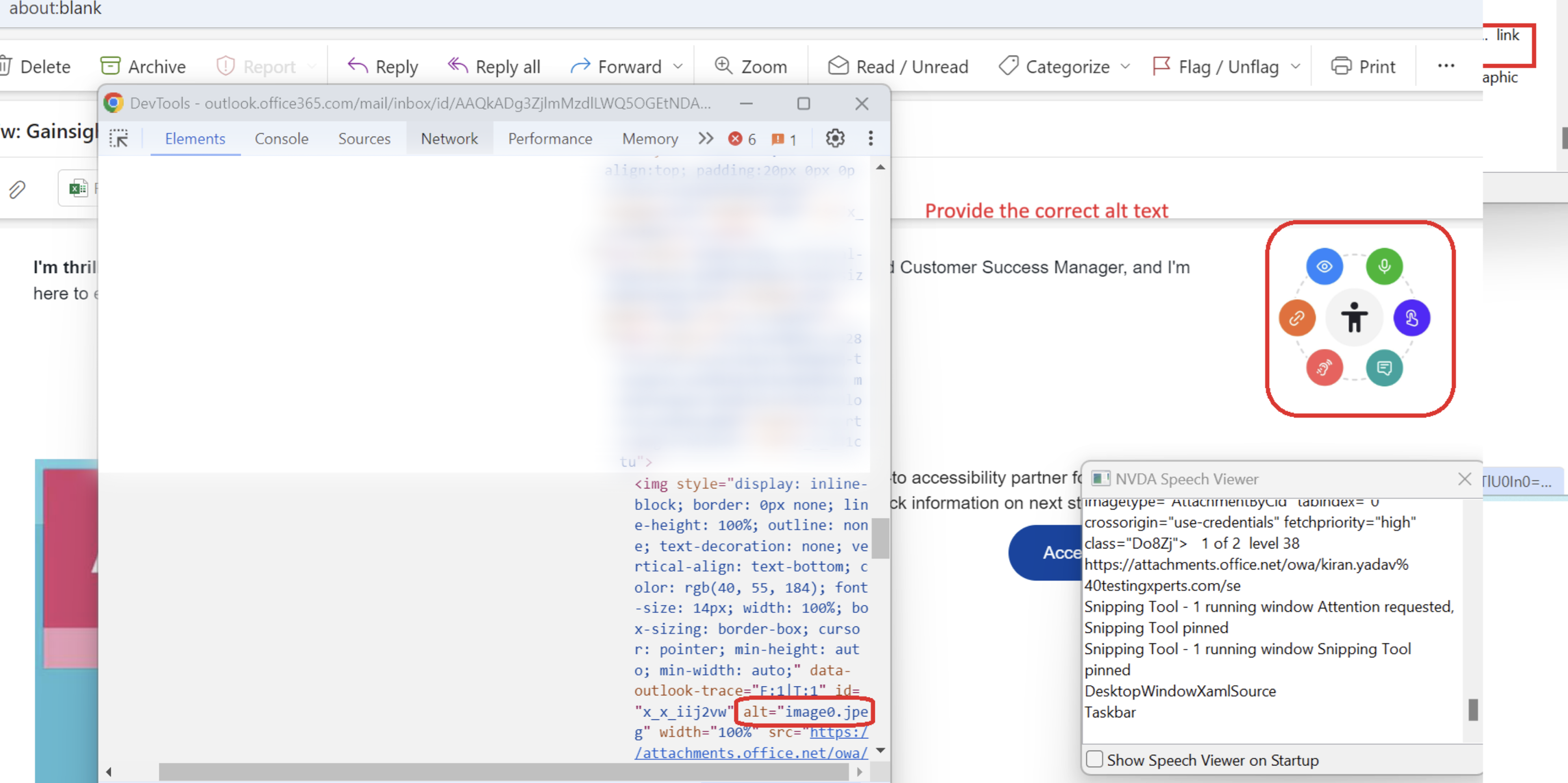
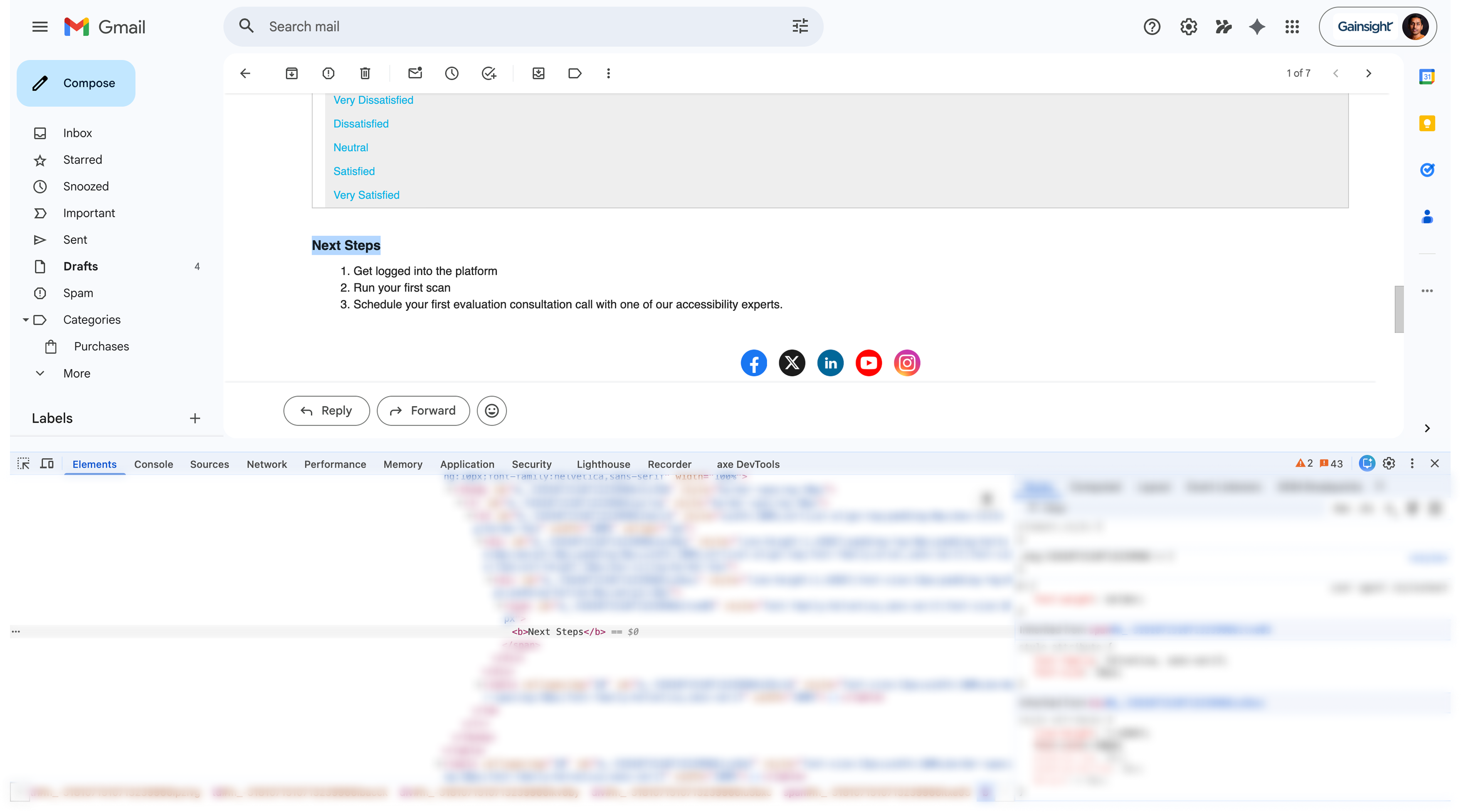
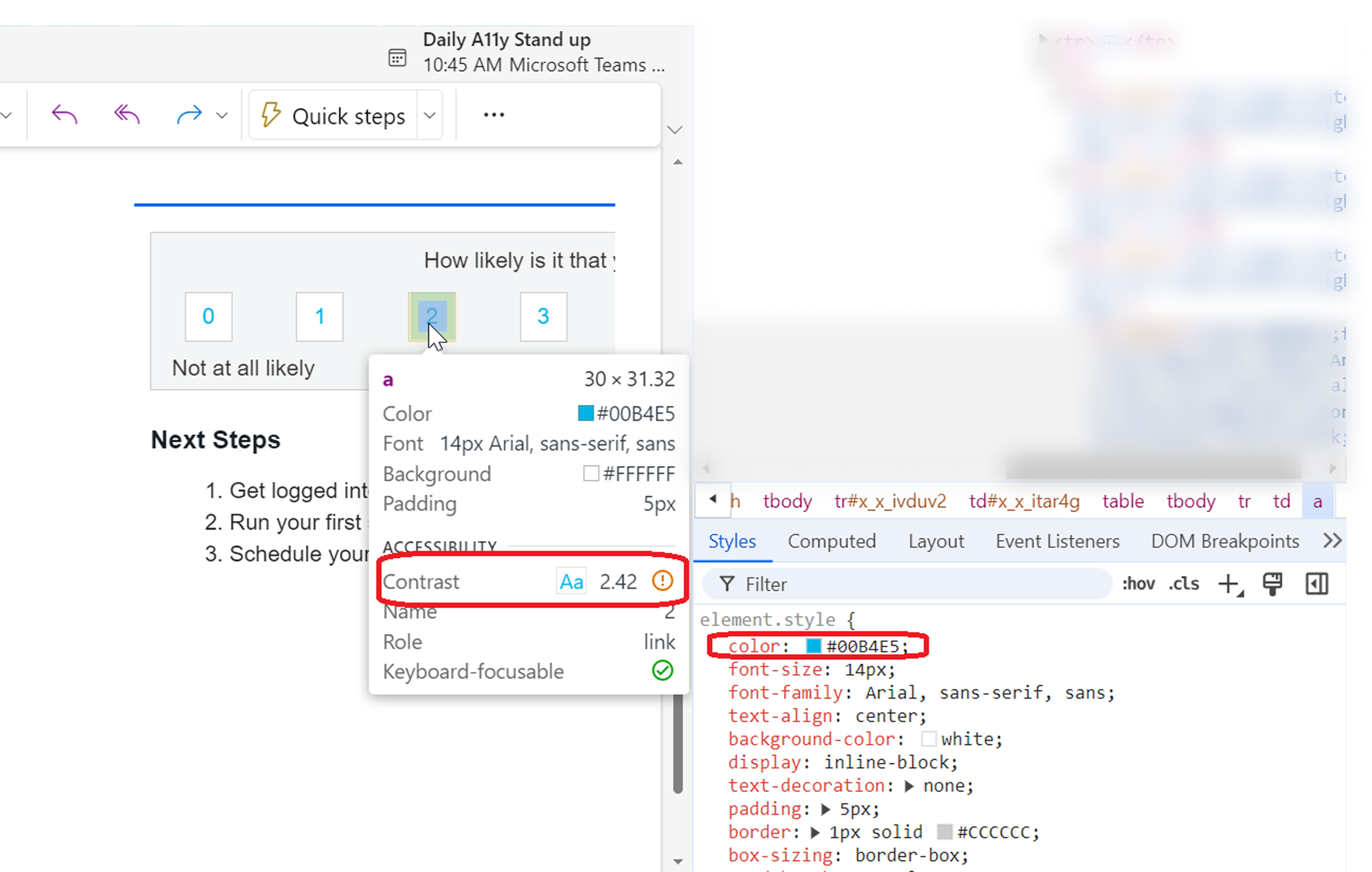
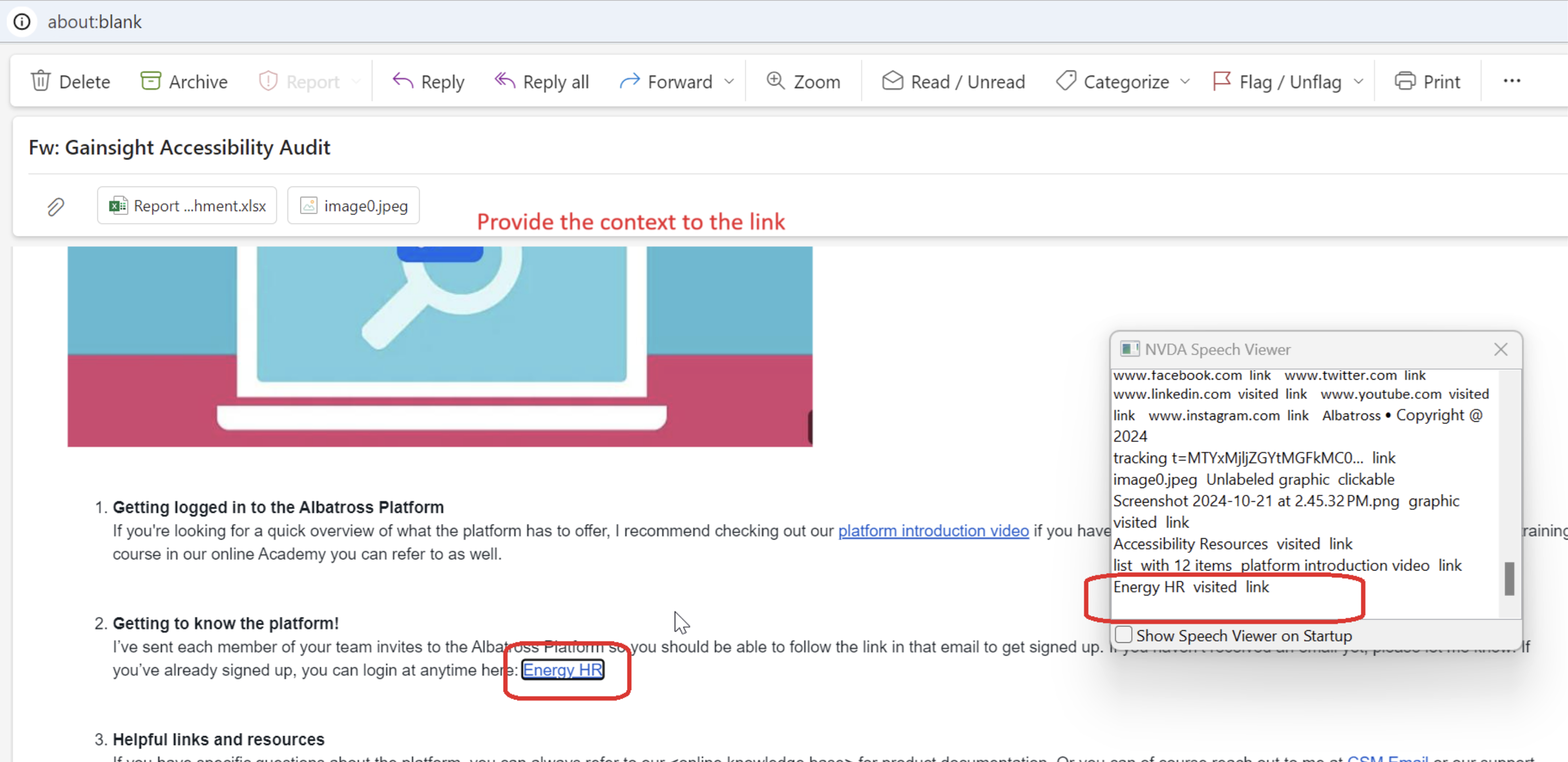
I read every finding. For each one I decided whether it was valid in our product context, whether it duplicated something already covered, whether it needed a design decision before it could be fixed, and whether the right fix was local or belonged at the component level. Where the report was ambiguous, I raised it rather than passing the ambiguity downstream.
What stood out was the pattern behind the findings: the same categories of failure repeating across the platform.
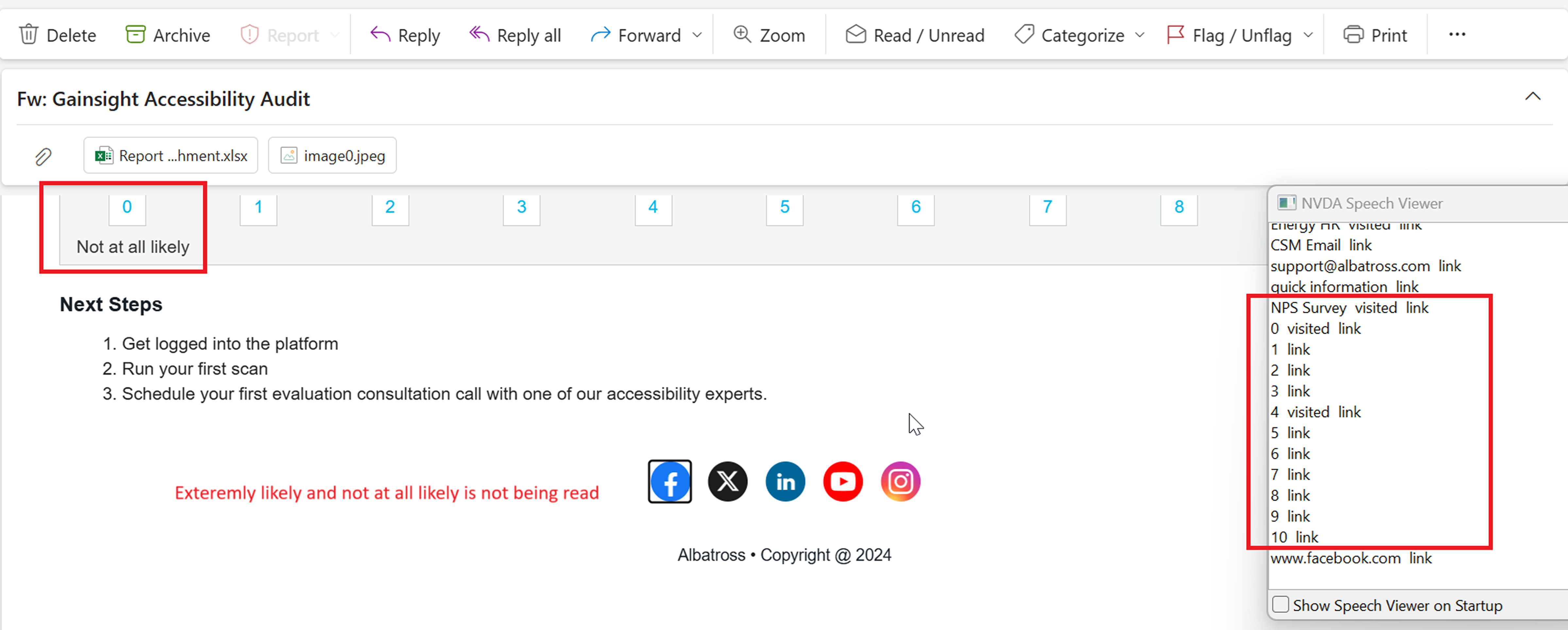
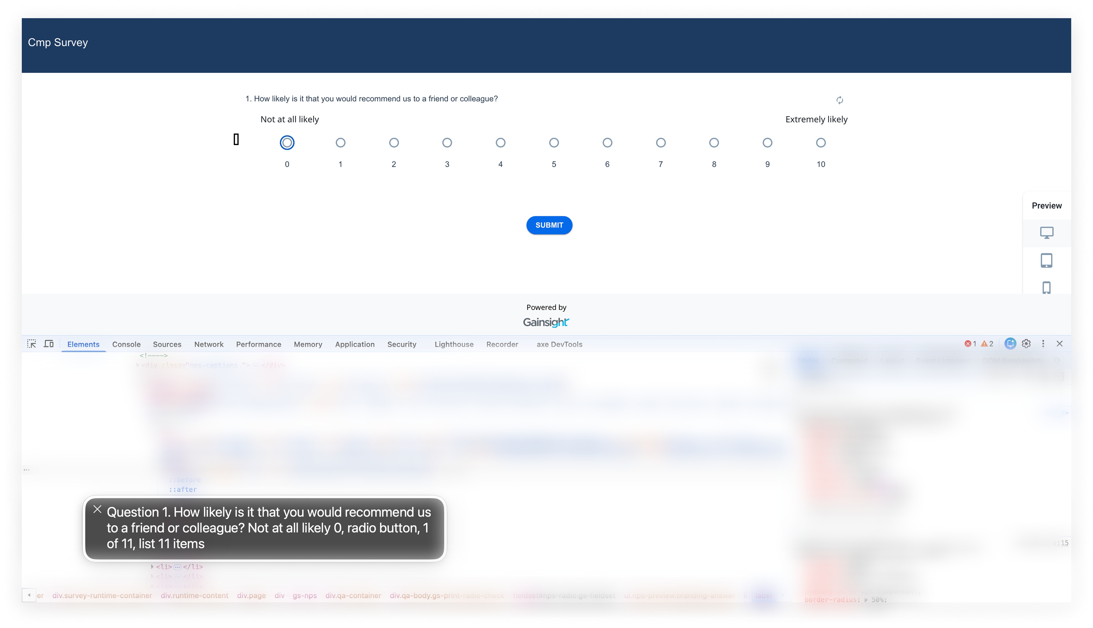
Clarifying findings before engineering started
Once a module was fully evaluated, I ran a war room with the vendor, design, engineering, and QA before any fix was written. The purpose was to settle open questions in one room, in one hour, rather than across twenty Jira comments over three weeks.
Without that step, engineers would have received the audit as a flat bug list and fixed each item where they found it. Some of those fixes would have been wrong, and most of them would have come back.
Phase 2 gave me an opening
Phase 1 taught us something uncomfortable. The same failures kept recurring across different screens because they were not really screen problems.
The same components, dropdowns for example, existed in multiple variations across modules. Each behaved slightly differently and implemented accessibility inconsistently. That realization ultimately shifted the direction of the work: from fixing screens to fixing the system underneath them.
Fixing them screen by screen would have worked, briefly. The debt would have returned the moment someone reused an old component.
CSM-facing modules were also running behind on the design system. So I made the case to leadership that one effort could close two problems: bring the modules up to the current design system version, and make them accessible in the process.
Mapped the drift, module by module
My team and I divided the surfaces and captured screenshots of every component discrepancy, screen by screen, to see the true scope of the problem.
Pointed engineering to the canonical version
Mapped each discrepancy to the correct design system component, so conformance became a property of the system rather than a per-screen effort.
Reviewed weekly, decided by use case
Aligned weekly on use-case-driven decisions so adoption stayed grounded in real product needs.
Less visible than Phase 1. More important.One accessible version of each
Screenshots of the canonical, conformant components go here.
Specifying the behaviour, not just the violation
Audit output tells engineers what is broken. It does not tell them what correct looks like.
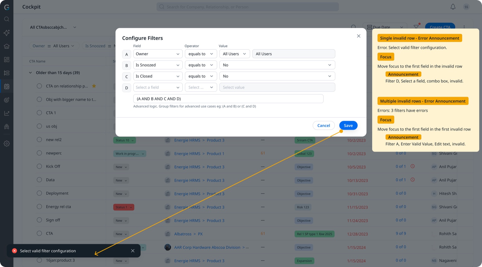
So I documented the expected behaviour at the level engineers actually build against: what the screen reader should announce for each control, where focus moves when a modal opens and closes, and what gets announced when one field is invalid versus when five are. PMs reviewed the documentation before handoff.
Engineers stopped inferring accessible behaviour. It was specified.
- Screen-reader announcement expectations documented per control
- Modal focus management: entry and exit focus mapping
- Error announcement specifications for single and multiple invalid states
Reducing engineering load with AI-assisted fixes
By Phase 2, AI tools were part of how I worked day to day.
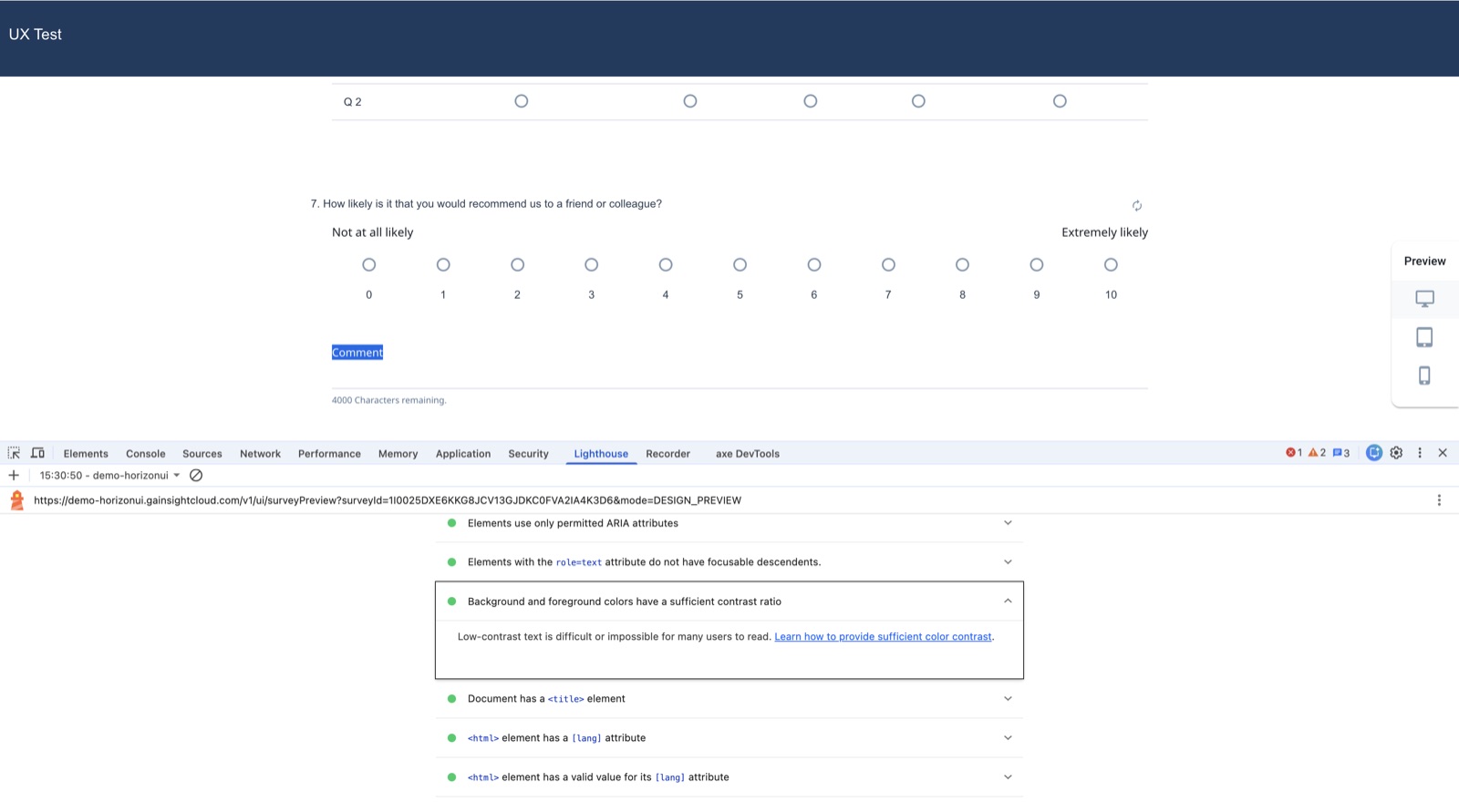
After reviewing the findings, I identified the issues that were UI-only: the ones that carried no risk to data integrity and no dependency on other modules. Because the platform is interconnected, that judgement mattered more than the fix itself. Getting it wrong would have broken something else.
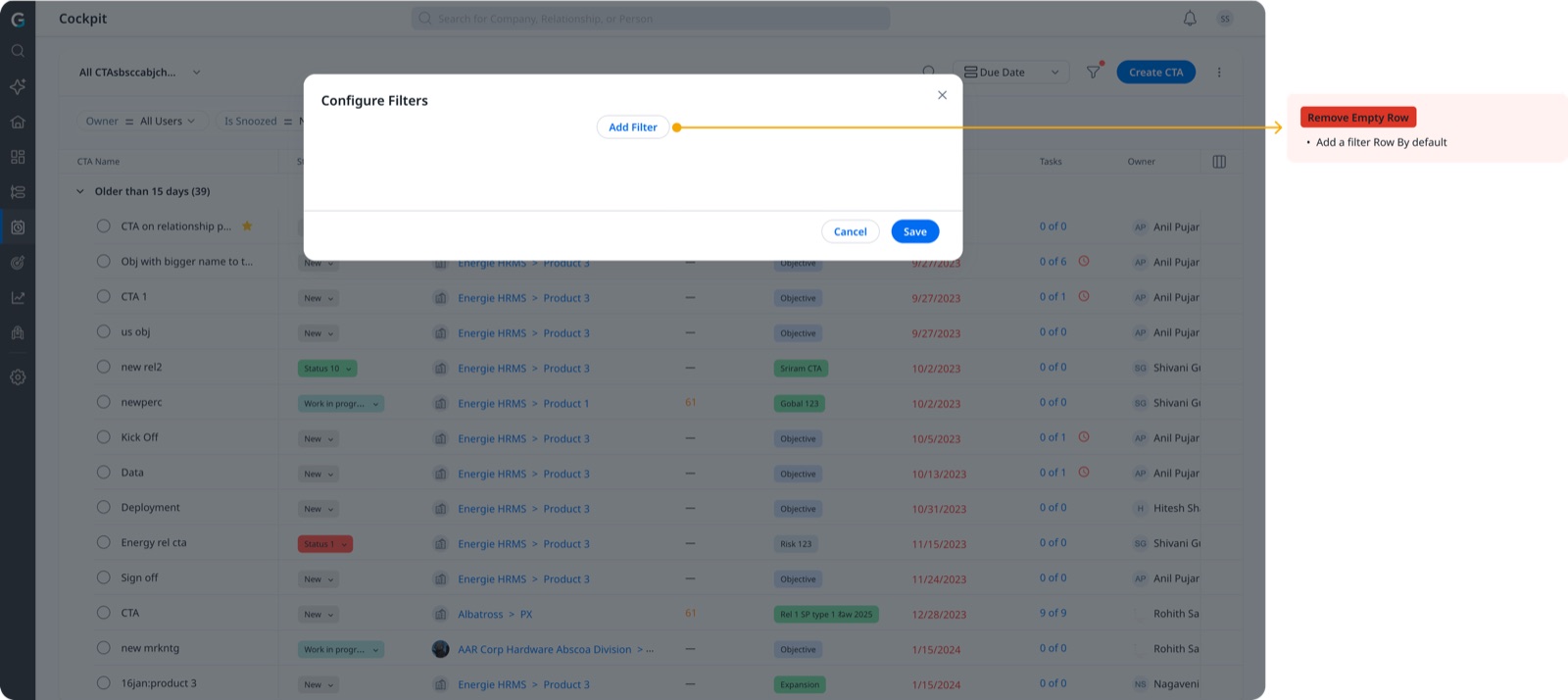
For those issues, I wrote the fixes myself using AI tooling. Engineering reviewed them and shipped them through the normal process.
It moved a meaningful volume of repetitive UI remediation off the front-end team's plate, and it let their time go to the fixes that genuinely needed an engineer.
Staying close to the customers
Sequencing customer-facing surfaces first was not only a technical call. It was a retention decision.
I kept the accounts who had raised accessibility close while the work was in flight: direct updates, honest progress, and visible movement on the specific issues they had asked about. The VPAT and the public accessibility statement gave them something concrete to point to internally.
At least one high-ARR account that had been tracking this stayed.
- Customer-facing surfaces sequenced first
- Direct line to high-ARR stakeholders
- Regular, credible progress updates
- VPAT and public statement as proof points
What changed
- Accessibility was reactive and unowned
- The same components existed in multiple versions
- Audit findings arrived as a flat bug list
- Engineers inferred accessible behaviour
- No enterprise-ready proof
- A funded program with an owner and a definition of done
- One accessible version of each, adopted across modules
- Findings triaged, clarified, and specified before handoff
- Behaviour documented per control
- VPAT obtained and a public accessibility statement live
What I would do differently
The program worked, but it started later than it should have. The signals were there for a year before anyone, including me, treated them as one problem instead of many small ones.
Unowned work does not announce itself. It arrives as a series of manageable requests, and it stays invisible until someone decides to count them.